Button
Button displays an action, summons a popup or modal, and changes elements of the website. On the VTS platform, they are used in table, popover, model, cards, pagination.
How to choose shape
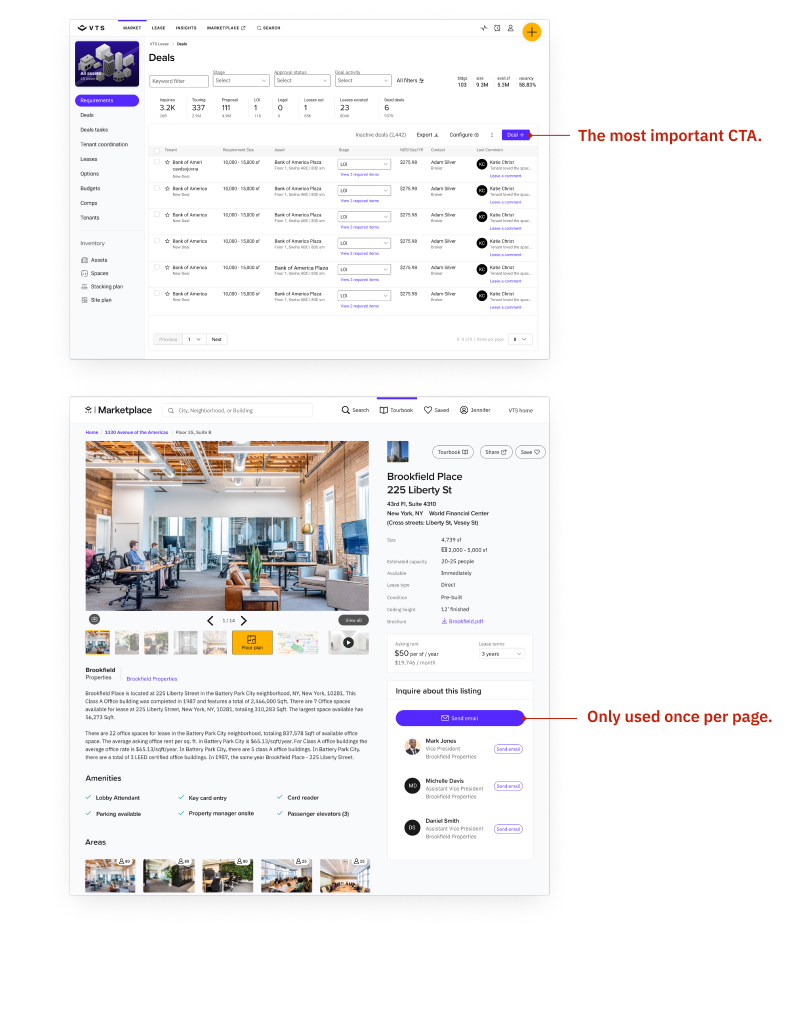
Each platform has its unique tone and identity, leading to different button style choices. Whatever the platform's button style, it needs to be coherent throughout the entire product. e.g., Marketplace uses pill-shaped buttons; Core uses square buttons.
Do not mix and match different styles in one platform.
How to choose button variant
The button system and semantic meaning of the name are universal across the products regardless of the button styles. See detailed usage below.
Primary button
The button spans the entire width of the parent container.

Use the primary button on the page to highlight the most important action to guide the user on the next step. Overuse of primary buttons will lead to user confusion and visual cluster.

Use primary button as CTA in a model.

Secondary button
Secondary buttons are used for non-primary action buttons. There are two variants, secondary and secondary neutral. Use secondary as default. Use secondary neutral when need a flatter visual hierarchy. See Secondary neutral for details.

Use secondary button as default for the non-primary action buttons. It can appear repetitively.

Use secondary button to give a branded feeling.

Secondary neutral button
Since the default secondary button is a branded color, in the case of information-dense views like table forms, secondary button can cause a visual cluster as it puts too much indigo color across the page. A neutral-color secondary button gives designers the freedom to clean up the visual cluster with many functional buttons on one page.

Use secondary neutral in the secondary button use cases, but when less emphasis is needed.

Tertiary button
Tertiary buttons are commonly used for actions in small space like tables, cards, matrix.
Use tertiary as default. When default is too colorful in context, use tertiary neutral.

When using tertiary buttons in the context, they can’t be used inline with the content. If inline, use links.

Tertiary neutral button
Tertiary neutral buttons are are tertiary buttons with less visual attentions. It is commonly used for technical features in a table like export, import, config.

We want to let users focus on the essential tasks and minimize the visual stimulation by muting the repetitive technical buttons that do not guide users to the next step.
