Figma library
This page provides guidance on how to use Figma components and what designers can expect to see in the configuration.
Link to Terra library in Figma.
1. Find components
Follow the below steps to find the components in the Figma library.
Step 1: Enable the Terra library
Turn on the Terra library in the Team library under the Assets Tab.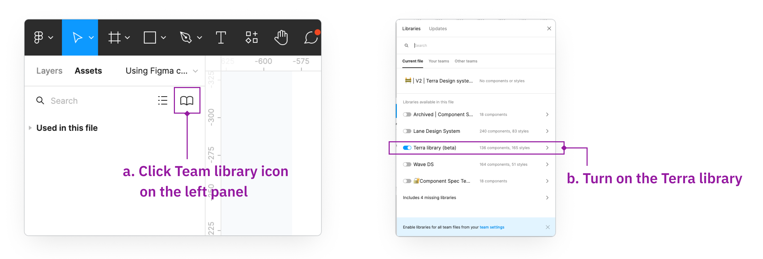
Step 2: Checkout component list
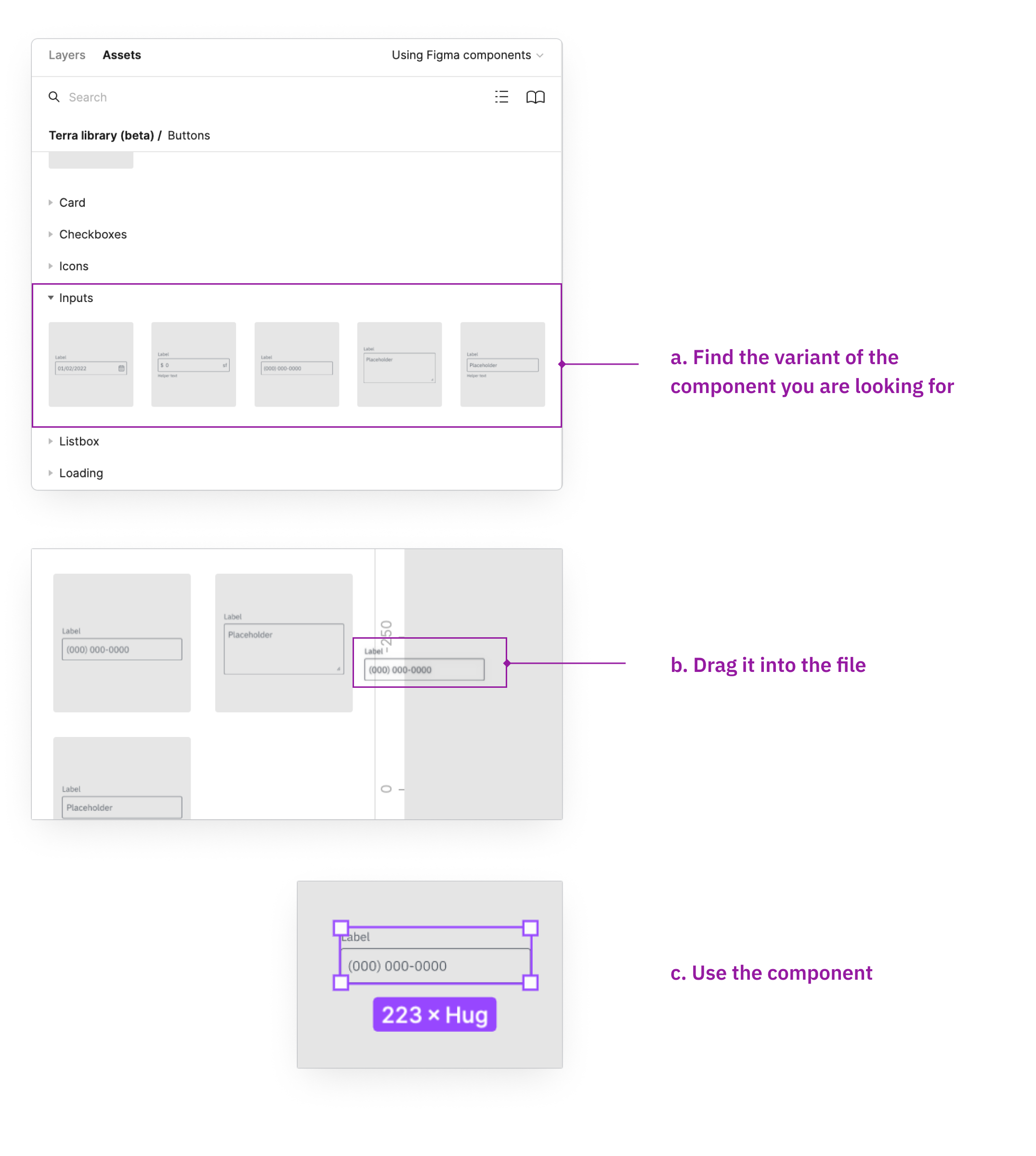
You can find all the released components under Terra library.
For the components that have variants, you can find the variants by expanding the category.
Tips: Library components are all in purple frame. Components in blue frame are your local components.
Q&A: What if you can’t find what you want?
If you can not find what you want, you may want to propose a new component. Check outthe process pagefor details.2. Leverage components’ configuration
Manipulate the properties in the configuration to get the visuals and functionalities that fit your design. Below is a list of common methodologies to interact with the configuration.
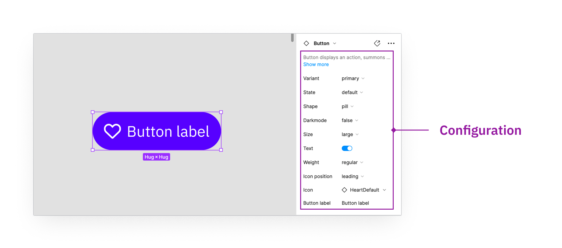
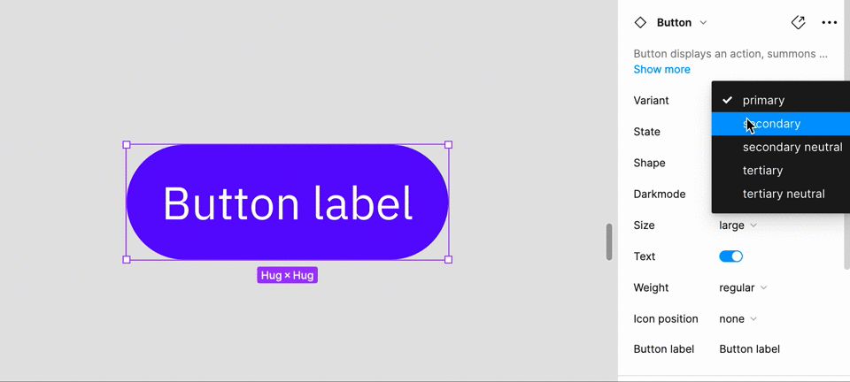
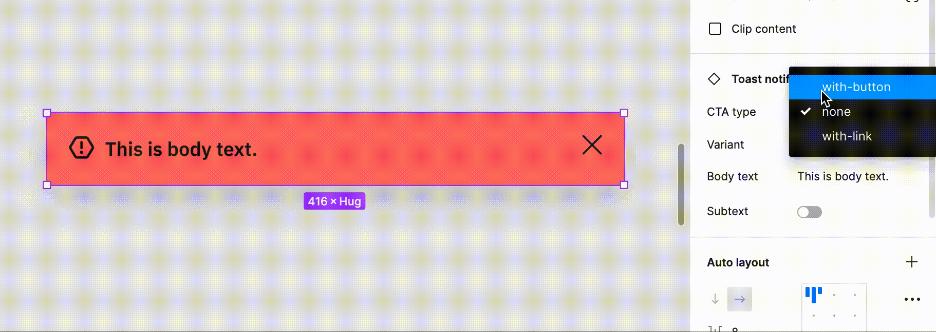
2.1 Dropdown
When you see the properties are presented in the format of dropdowns, you can manipulate it by selecting the values under drop down.
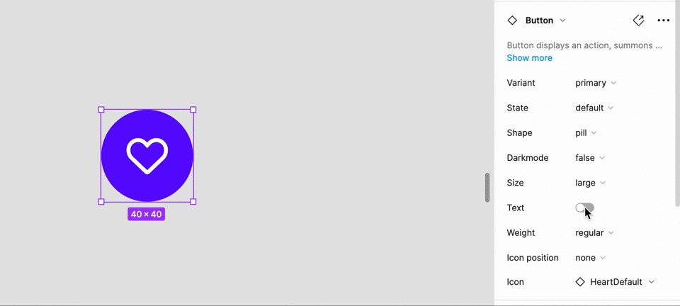
2.2 Switch
Switch is used when the property is a boolean value. Some common properties that use switch are On/Off, Required, Helper text, Label, Clearable.
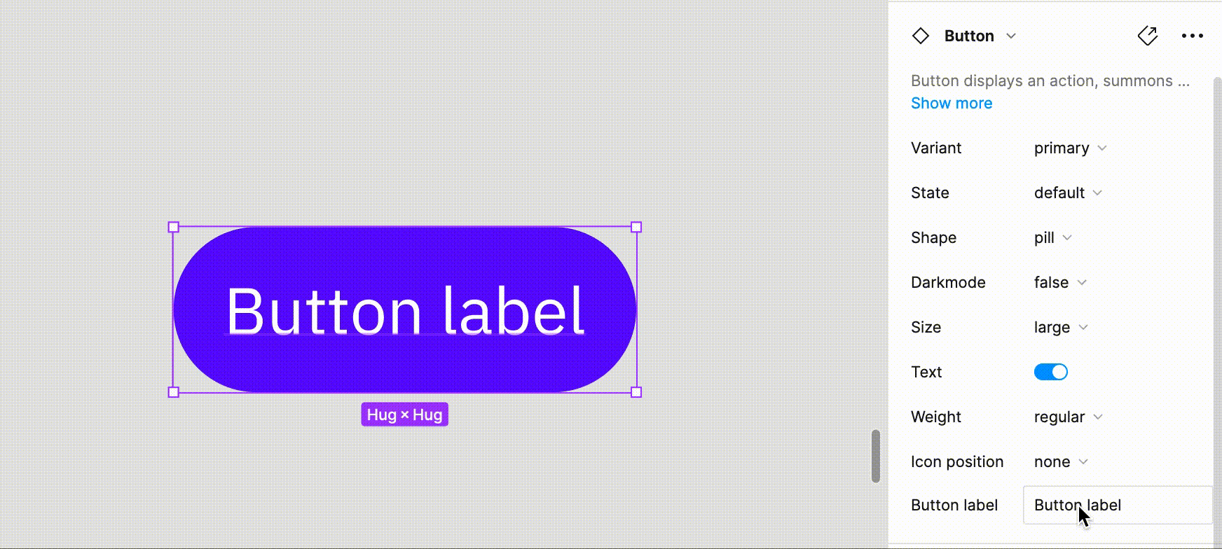
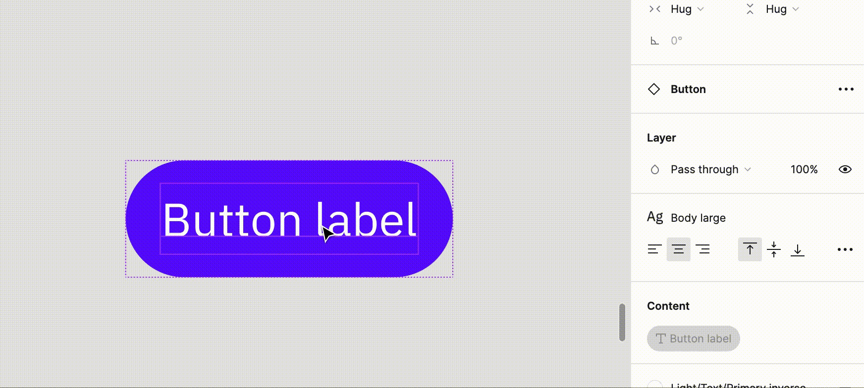
2.3 Text
Text applies to the copy in the component. You can either type directly in the config or click into the text component to type.
1) Change text in the control panel.
2) Change text by selecting text layer.
2.4 Icons
Search for icons and apply the desired one through the config panel. Please note that an icon position needs to be selected first to enable the icon selection.
2.5 Components
Component applies to components in the components like buttons. Select the component and manipulate the properties of the component inside.
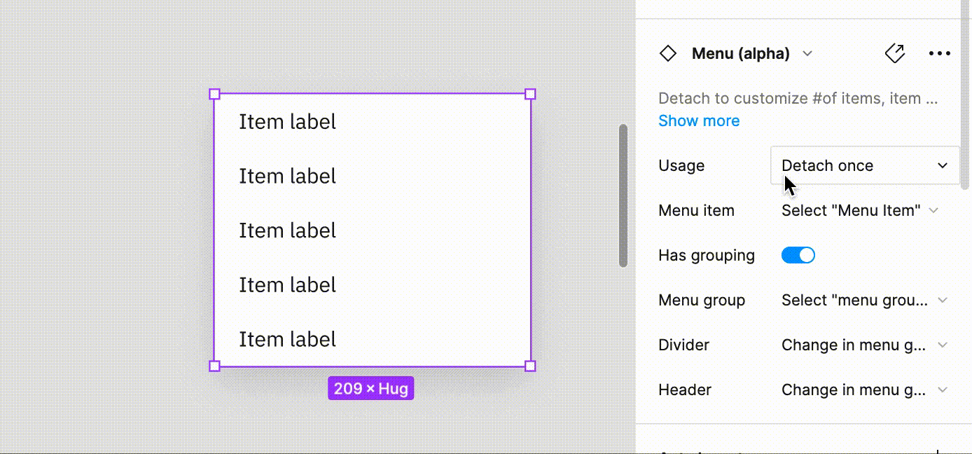
2.6 Detach to use
Some components require designers to detach to use in order to provide flexibility in the layout. You will see a Usage section to instruct it. After detaching, you can manipulate properties in the sub-components.
*Only detach the components when the config instructs to do so.
3. Communicate with dev
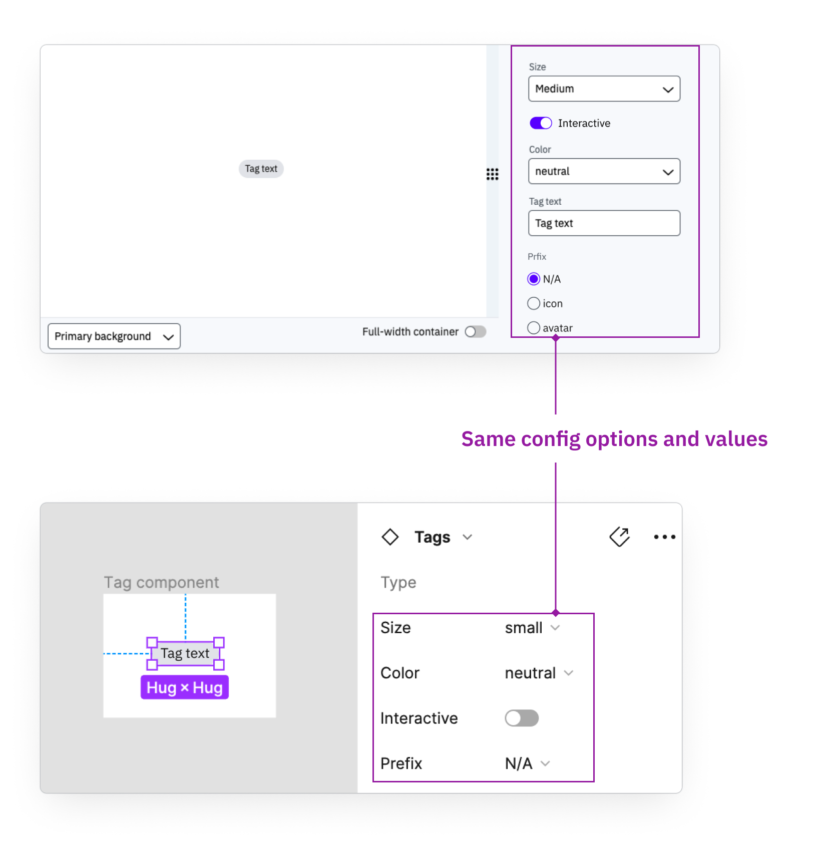
All the config in Figma is 1:1 with the properties developers will see. Make sure all the configs are in the desired setting before hand-off.

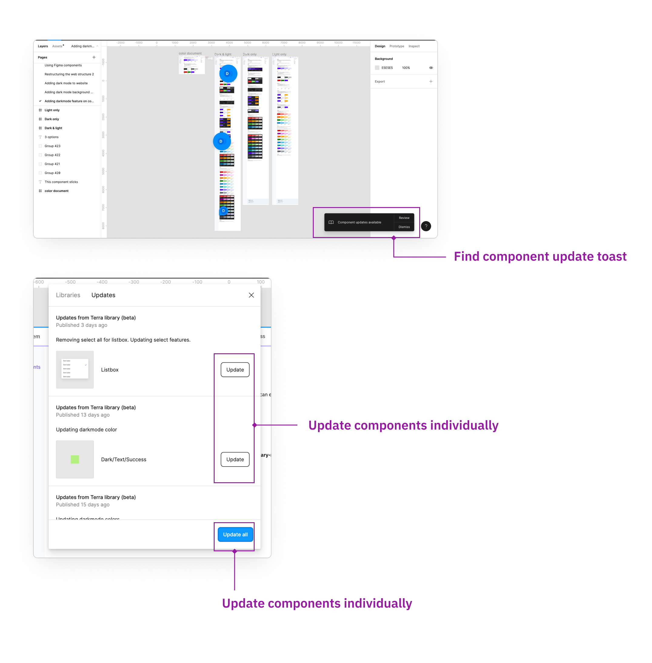
4. Update the components
You will see a component update toast on the bottom right if there are any updates. You can selectively adopt the changes.